


Drawing beautiful trees in just a few minutes
Added: 04.04.2015 в 15:02 Views: 57533
Drawing beautiful trees in just a few minutesKlubokhttp://klubok.work/14/83/5754/Klubokhttps://klubok.work/css/image/top-logo-en.pngThis article will primarily be useful for beginner artists, but I hope it can also be helpful for more experienced individuals. Having a tablet is desirable, as the lesson is based on it.
First of all, let's start with what not to do. If you have a lot of free time, you can spend the next few weeks meticulously drawing each leaf. I categorically do not recommend doing this; there is a much easier and accessible way.
So, are you determined to "grow" your own tree, or even an entire forest? Then let's get started.
First, create the future "canvas" for your masterpiece and create a new document sized 1024*1024 pixels. In it, we will create our own brushes, after which we will deal with several parameters that will significantly ease our life.
The problem for all beginners is the fear of figuring out how brushes work in Photoshop, what many parameters affect, and what they are for. This is not our method; brushes need to be loved, cherished, and nurtured. Then the brushes will respond to you in kind.
Returning to the new document we created, let's start making templates for future leaves. For the preparation of this lesson, I created 4 different brushes:


1) the densest foliage
2) Fewer leaves
3) 3 leaves
4) a single leaf
The first and main brush will be used to create the primary mass of the future tree. The second and third are more for adjusting the shape and creating additional details. The fourth is for adding individual leaves to the crown, so it doesn't look monotonous.
There are many descriptions on the internet about how to create brushes. The main points are the document size should be up to 1024*1024 pixels, and you should draw on a white background with black color. The black color in the brush will be the most opaque, while white will be the opposite - transparent. All shades of gray will have varying transparency depending on their closeness to black or white.
So, let's draw leaves. It all depends on your imagination and preferences. I ended up with something abstract, a hybrid of birch and maple with a touch of poplar.
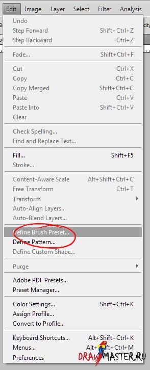
After all the brushes are drawn, you need to add them to the brush set. Go to the "Edit" menu and click "Define Brush Preset." In the dialog that appears, choose the name of the brush, and voila, it’s done. Our brush has appeared in the set, which can be accessed by pressing F5.


We add all the drawn brushes one by one and proceed to create a unique landscape.
First, it is necessary to outline and draw the tree trunk with branches on a separate layer. I made the background a dirty gray, and the tree a gray-brown. But at this stage, it is not important yet.


Next, we create a layer below the tree and set up the brushes.
In the Brushes window, we are interested in three main groups:
1) Shape Dynamics
2) Scattering
3) Color Dynamics
Now, in order:
1) Shape Dynamics controls the size changes of the brush while drawing. The main parameter Size Jitter is best left at zero. Control should be set to Pen Pressure. As a result, strong pressure will leave the largest leaves, while light pressure will leave smaller ones. The second parameter, Angle Jitter, should also be left at zero. Control - Direction. When drawing, the direction of the stroke will be taken into account, and the brush will rotate according to the direction. This helps to avoid identical areas in the image. The rest in this tab can be left untouched.

2) Scattering speaks for itself - how far the image will appear from the center of the brush. The Scatter parameter is measured in percentages. The larger the percentage, the further from the center the brush paints. You should try setting different values and see what works best for you and fits the drawing. In my case, it was about 200%. It's also best to set control to Pen Pressure. Together with the Shape Dynamics parameters, strong pressure will produce larger leaves further apart from each other.

3) Color Dynamics is responsible for varying the color palette of the brush from the chosen color in the palette. The necessary parameters are:
- Hue Jitter - how much the hue of the brush will deviate on the color scale. The higher the percentage, the more the color will stray from the selected one. In our case, 4-5% will be enough to keep the leaf colors from varying too much and avoid completely unnecessary shades.
- Saturation Jitter - variations in saturation. I did not adjust this, but you can experiment.
- Brightness Jitter - how much the brightness of the brush can deviate towards white and black colors. In my case, 10-12%.

Now that the main parameters are covered, we can practice a bit to understand how the brushes behave, after which we can start drawing the foliage. Choose the main color and go for it.
1) With a few strokes of the first brush, I marked the crown behind the trunk.
[center]

2) Using brush #2, I marked the lower branches.

3) Create a new layer above the trunk. With brushes 1-3, I draw the crown in the foreground.

4) At this stage, I changed the hue of the brush to a lighter tone. The crown became denser, both in the foreground and the background.

5) Let's add some volume to our tree, if you haven't done this earlier.

6) Let's add some saturation to the background.

7) Let's add some yellowish leaves for mood.

8) Let's draw some grass in the foreground and slightly adjust the background (the brush, again, is better to make yourself, as I did).


9) And in the final stage, I made a gradient fill for the sky, adjusted the color and brightness of some layers, drew a couple of clouds, and with a hard square brush, with the Scattering parameter enabled, added strokes over the crown to avoid the work looking boring and monotonous.

So, our work is ready. In half an hour, a rather cute and pleasing to the eye landscape was born. Out of these 30 minutes, your humble servant spent two-thirds of the time preparing illustrations for this lesson.
This is certainly not a masterpiece, but I pursued a different goal - to show how effective working with brushes can be if you approach the task wisely. You don't have to limit yourself to four brushes; the foliage of trees or grass is not mandatory. They can be any arrays - bubbles, waves on water, swarms of insects in the air, clouds, and much more.
But it is also important not to forget that this method is not a panacea and serves only specific purposes in your work. The main thing is to use it skillfully when it is truly necessary. Don't forget to experiment, read lessons, learn from your colleagues, and develop your unique style.
Good luck and happy creating! =)
Category: Images